

Biotech product re-brand
Making FlowDeploy’s brand fun, approachable, and easy to understand for a wider range of customers.

Doordash post-acquisition re-brand
Combining Bbot and Doordash’s visual branding to be compliant with the new owners, while remaining true to the Bbot brand.

The worlds most Versatile brand
Look hotter, run faster, jump higher, have a nicer ass, break records, be gay, wear heels, don’t be gay, we love the binary. #versatile
FlowDeploy

FlowDeploy Re-Brand / New Logo
While working on the FlowDeploy product, I also brainstormed and created a new logo.
Goal: Update the FlowDeploy Logo.
The New Logo Design
The word mark base font is “Figtree”. It is altered to have rounded corners to soften the logo as a whole. The weight differential on “flow” and “deploy” was to create a more accessible logo for users who have color vision deficiencies. The glyph combines the first two letters of the company name, “f” and “d”. It is also representing an arrow pointing upward as to “deploy” your pipelines into the cloud.

Logo Evolution

Visual Brand Guideline


Logo Design Process
Starting with sketches in a notebook, I then moved to Figma where I iterated through some of the top glyph designs.


Bbot

Bbot Re-Brand / New Logo
After Bbot’s acquisition by Doordash in March 2020, there was a new opportunity for both the company and our brand to evolve as it grew with Doordash’s new resources. As we moved forward with our operations, the marketing team worked together to slowly shift our content and branding to align more with our parent company.
Goal: Update and align Bbot’s branding and visuals with Doordash
The New Logo Design
In my development of the new Bbot logo, I wanted to utilize the recognizable Doordash logo without adding additional text to the logo (“powered by Doordash”, as seen on the most recent version of the logo). I decided to embed the Doordash “bullet shaped glyph” with Bbot’s now recognizable “serving tray/ bell glyph” making our partnership very literal. In addition to adding Doordash’s glyph I also altered the serving tray top so that it could stand alone as a glyph and the top would not seem as “floaty” as in previous logos.
For the “Bbot” script in the logo, I wanted to further align withh Doordash. Using one of their main font faces “TT Norms Pro”, I altered the corners of the script to be curved in the same way the “Doordash” script in their logo is.

Logo Evolution

From the very first robot logo in 2017 to the logo Doordash team gave us in March 2022, Bbot’s logo has evolved as the product was further developed and as the company grew.
Visual Brand Guideline


Logo Design in Figma
Here’s a screenshot of my workspace in Figma! Figma is my favorite design tool because you can track your progress and see what you’ve tried so that your next iteration can be even better. Here, you can see some of my design process as I work through shapes, fonts and alignment with the Doordash logo.
Resource Design Evolution


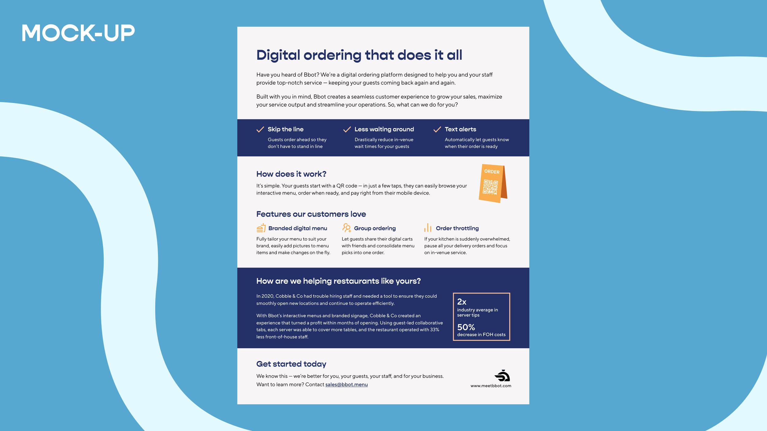
“Menu Best Practices” — November 2022 — Designed with the new visual guideline in mind, using the new colors, fonts and stylization.


“First Party Delivery” — April 2022 — Designed post acquisition with a new illustrations I created to build more of a human quality in contrast to the previous heavy tech branding. After this design change, our resource downloads increased by over 60%.


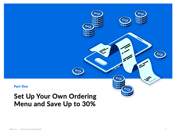
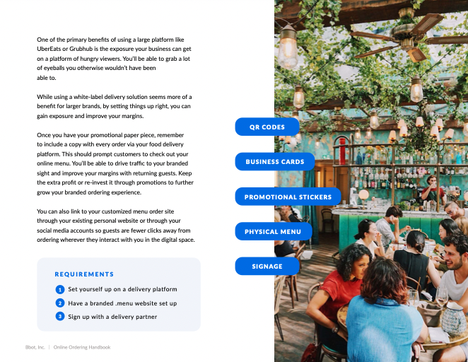
“Online Ordering Handbook” — June 2021 — Designed by the previous designer at Bbot.