Aegis Safety App

Aegis Mobile App
Aegis was a pre-seed startup. It is a safety app that is that allows the user to contact 911 and share important details without talking.
Goal: Create a basic sign-up and onboarding flow to present to potential investors.
Sign up/Login flow
Flow includes error states and the alternative “Login” state.
Choosing a Plan
This was important for the investors to see what levels of the app there would be. There are 3 separate flows here for the 3 different plans.
Profile Set-up
Setting up the profile in this level of detail is important because the information given here will be sent to emergency services when they use the app.
Situational Prompt Selection
This page should presents a list of crisis situations. Users are able to select up to 8 situations. These situations will later be used to speed up contacting emergency services if/when the time arises.
Form Fill Completion Page
A buffer page that lets the user know that everything is complete and they are ready to use the app.
Home Page
This is where the actual usage of the app comes into play. Here the user would swipe for SOS, and then use their pre-selected situations or other situations. They can then add details and submit. The idea is that law enforcement would be notified of there being an emergency immediately and then gather information as the user selects/types out more information– similarly to giving a 911 operator more information.
Navigation Page Draft
I included this page with some of my own ideas of what I thought might be helpful features for the app.
Discrete mode: Thinking about those stories of people calling 911 and speak to the operator as if they are ordering a pizza, I figured that there might be situations that someone might be looking over the users shoulder at the app. Though not fleshed out as an actual version of UX, I wanted to include this idea for the Aegis team to consider for future iterations.
Practice mode: Getting into an emergency situation and fumbling around on a new app sounds miserable, so I presented this practice slider to the Aegis team and explained that a practice flow would let a user have comfort in knowing what to expect when using the app.
Edit profile: An important feature to have especially when updating emergency contacts or address changes etc.
Bbot UI Wireframes

Bbot Wireframes
Bbot was a food tech startup that was acquired by Doordash. These wireframes were used in both a sales capacity for pitching, and a marketing capacity for website content, and social media.
Goal: Engage the user by demonstrating a simplified version of our web and mobile product.
Fake company screens for pitch decks
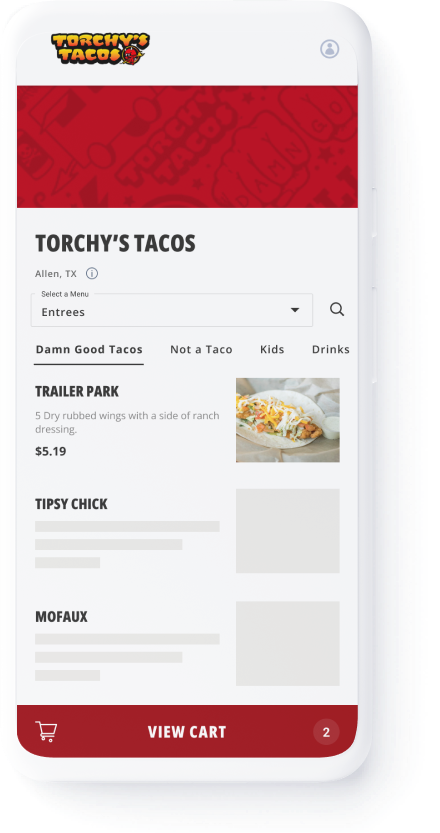
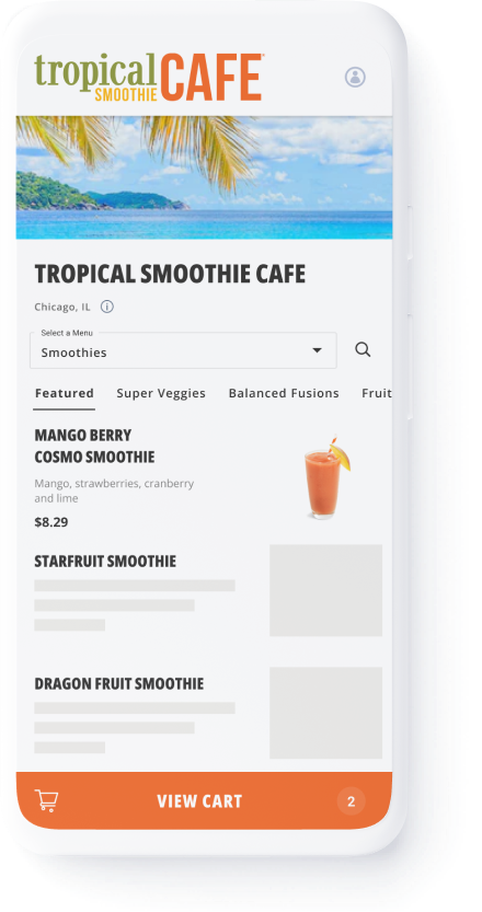
These “fake screens” were used by the sales team in their pitches to these businesses in order to show them what their menus would look like if they used Bbot! Simple wireframes like this would ensure that slide decks would not be too cluttered or overwhelming.
Mobile Screens: To show the owner/manager what the user would see
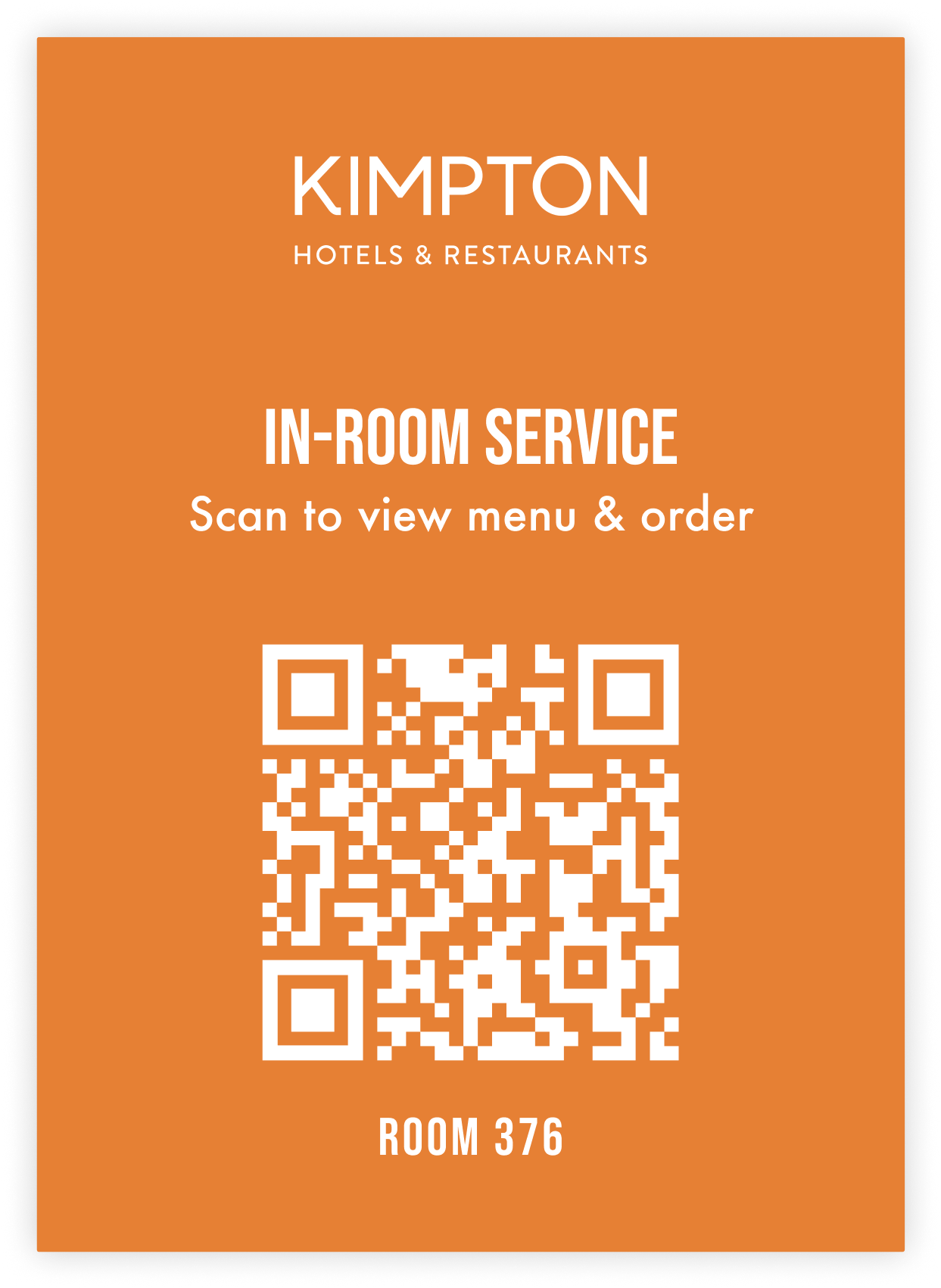
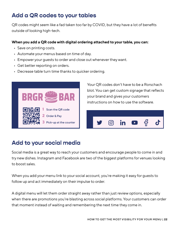
QR Code Signage: Showing what would be placed on tables/on the walls in order for the users to use the Order/Pay feature of Bbot.
TimeOut Market Vendors Screen: This represents a screen that the owner would see in order to manage the different vendors at the foodhall.
The Lonely Chef: A fake restaurant created for Marketing content and Sales Demos
Wireframes for website content
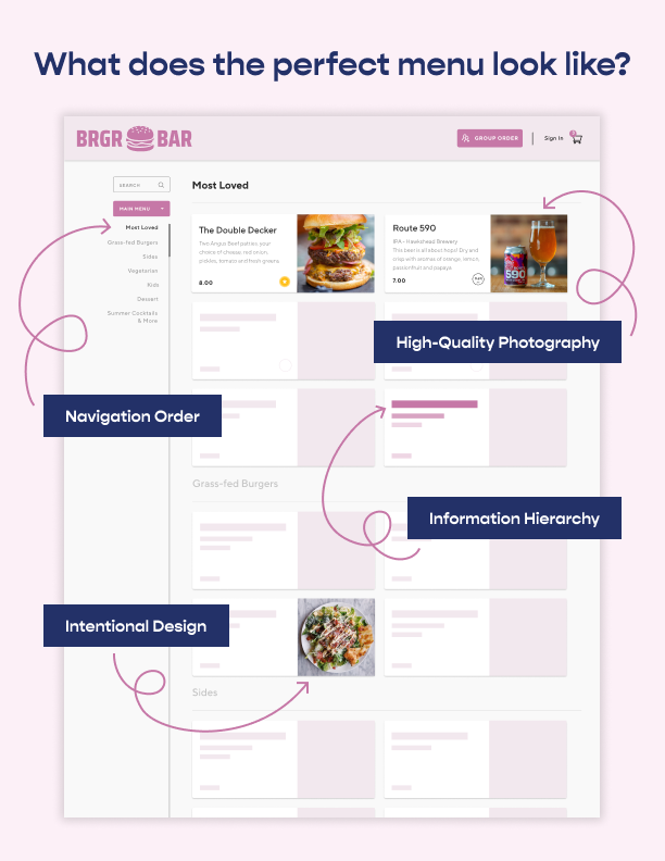
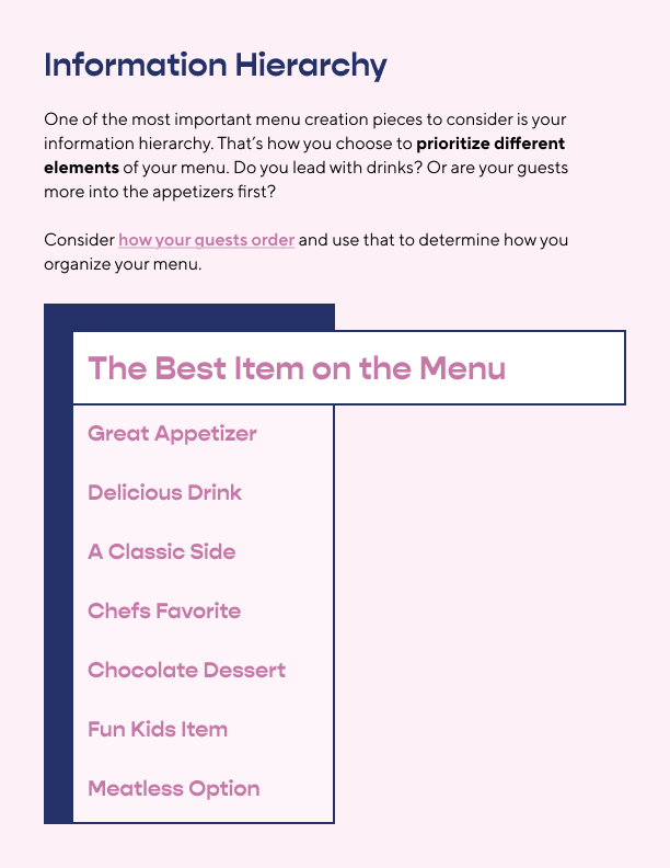
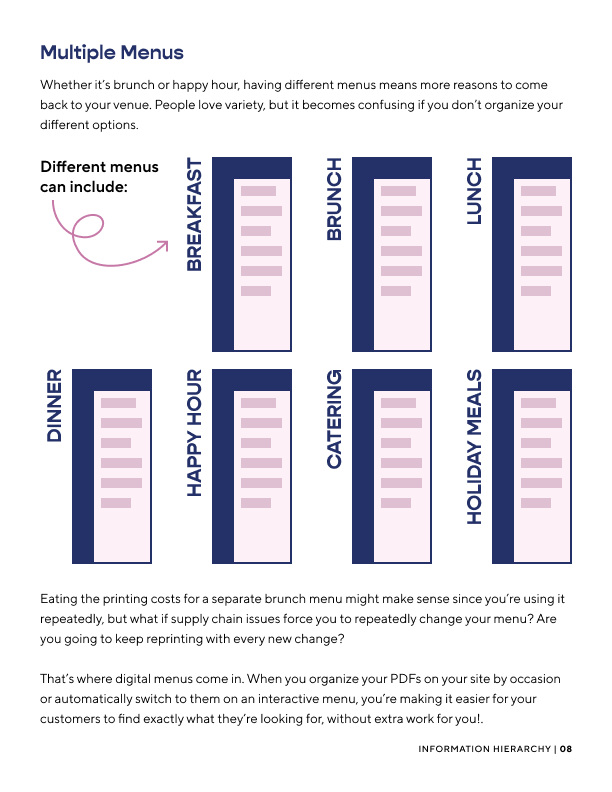
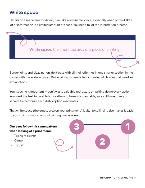
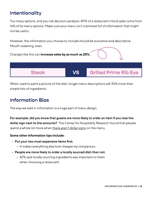
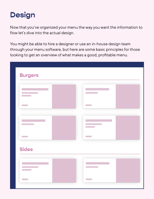
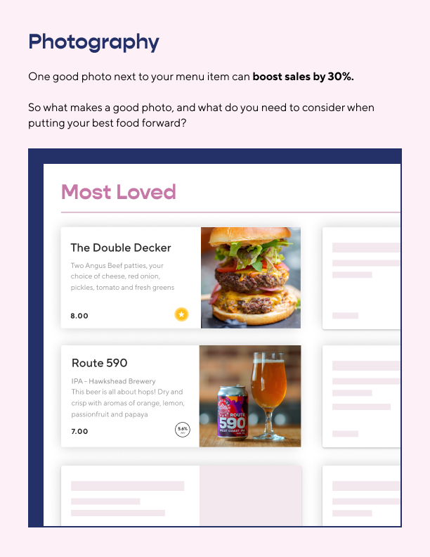
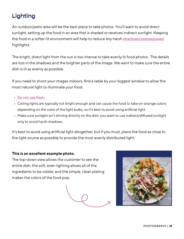
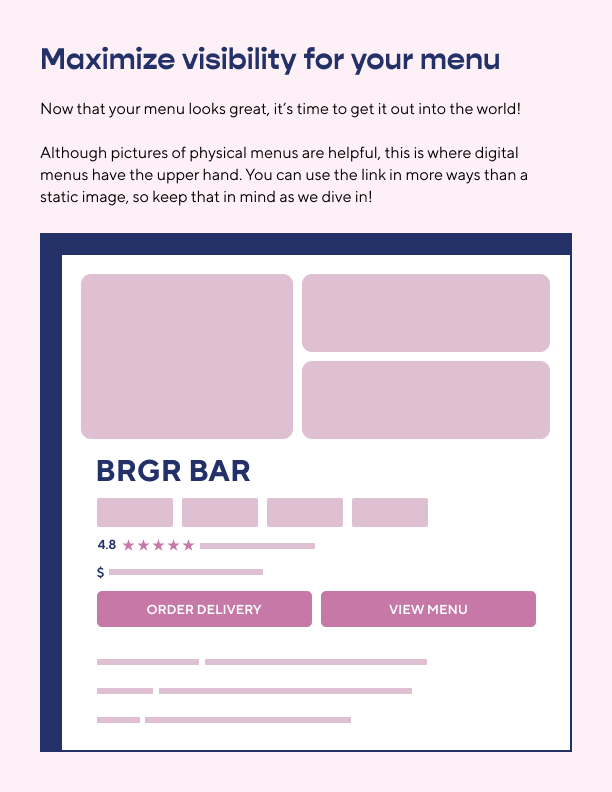
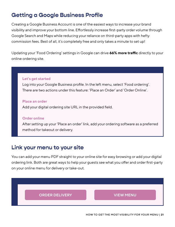
Menu Best Practices: This guide was created for Bar/Restaurant owners and managers to curate a better menu for the business. I created wireframes of Bbot’s app, Google Map’s business section, and physical menus.

